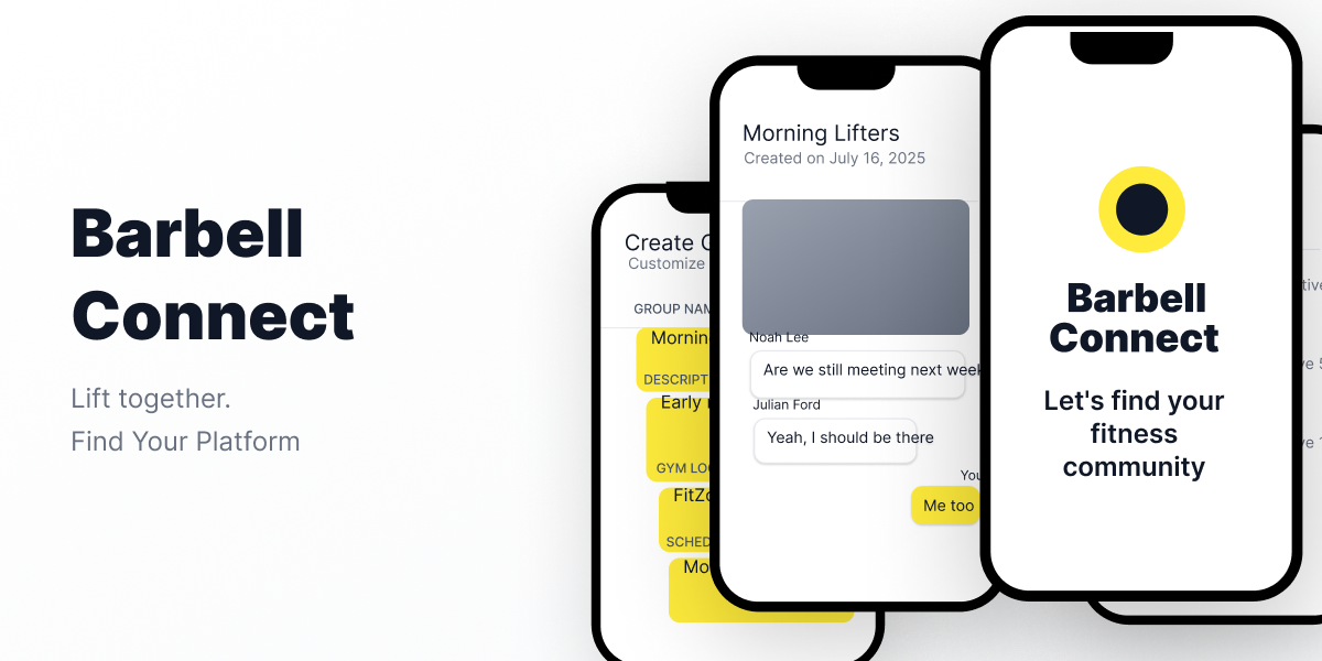
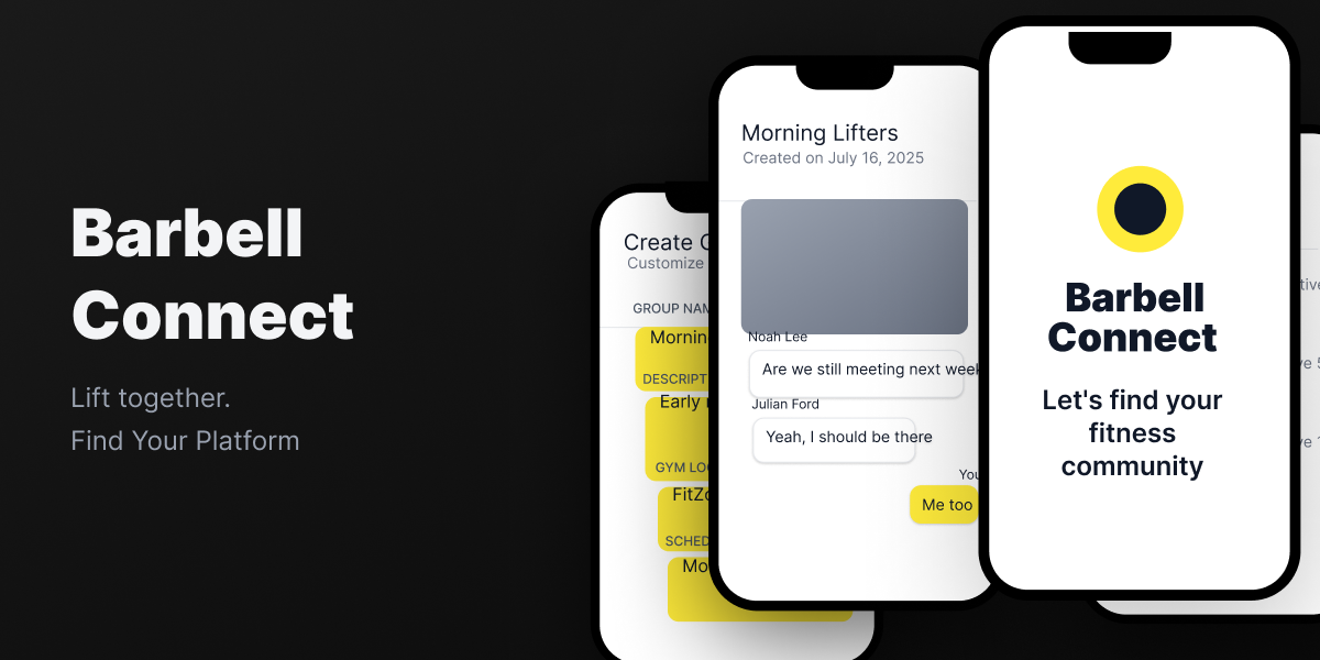
Project Overview
Barbell Connect is a gym discovery app built around one simple idea: finding the right gym should be about culture, not just proximity. I co-led the design and research on this project, and we used Lean UX to test our assumptions early and often. We ran surveys, usability tests, and A/B comparisons to figure out what actually mattered to lifters looking for their next gym. The challenge was balancing detailed gym info with a browsing experience that didn't feel overwhelming.
Goals
- Apply Lean UX to test what lifters actually care about when choosing a gym
- Design for gym culture discovery, not just location and price
- Make community reviews feel trustworthy and useful
- Keep the browsing experience fast and simple
- Validate every decision through user testing
Problem Statement
Finding the right gym shouldn't rely on word of mouth or luck. Most discovery tools push the biggest chains and ignore the independent spaces where real training communities form. People who care about culture, equipment, and community end up settling for whatever is closest.

Assumptions
Before any design work started, we documented what we believed to be true about our users and what would make the product work. We started by mapping outcomes to impact. Our two north-star metrics were retention and customer satisfaction, and we worked backwards to identify the leading and lagging behaviors that would move those numbers. Things like: does a user click into the events tab, do they log in and interact regularly, do they leave a review. Each one a signal we could actually track. From there we assumed there were two distinct users: a serious lifter who needs specialized equipment and qualified spotters, and a casual gym-goer who wants consistency and a more private, community-driven environment. Those assumptions drove nine hypotheses. We ran them through a prioritization canvas to figure out what was worth testing versus what we could ship with confidence, and landed on three features for the MVP: Profile Onboarding, Gym Profiles, and Group Chat Creation.
Design
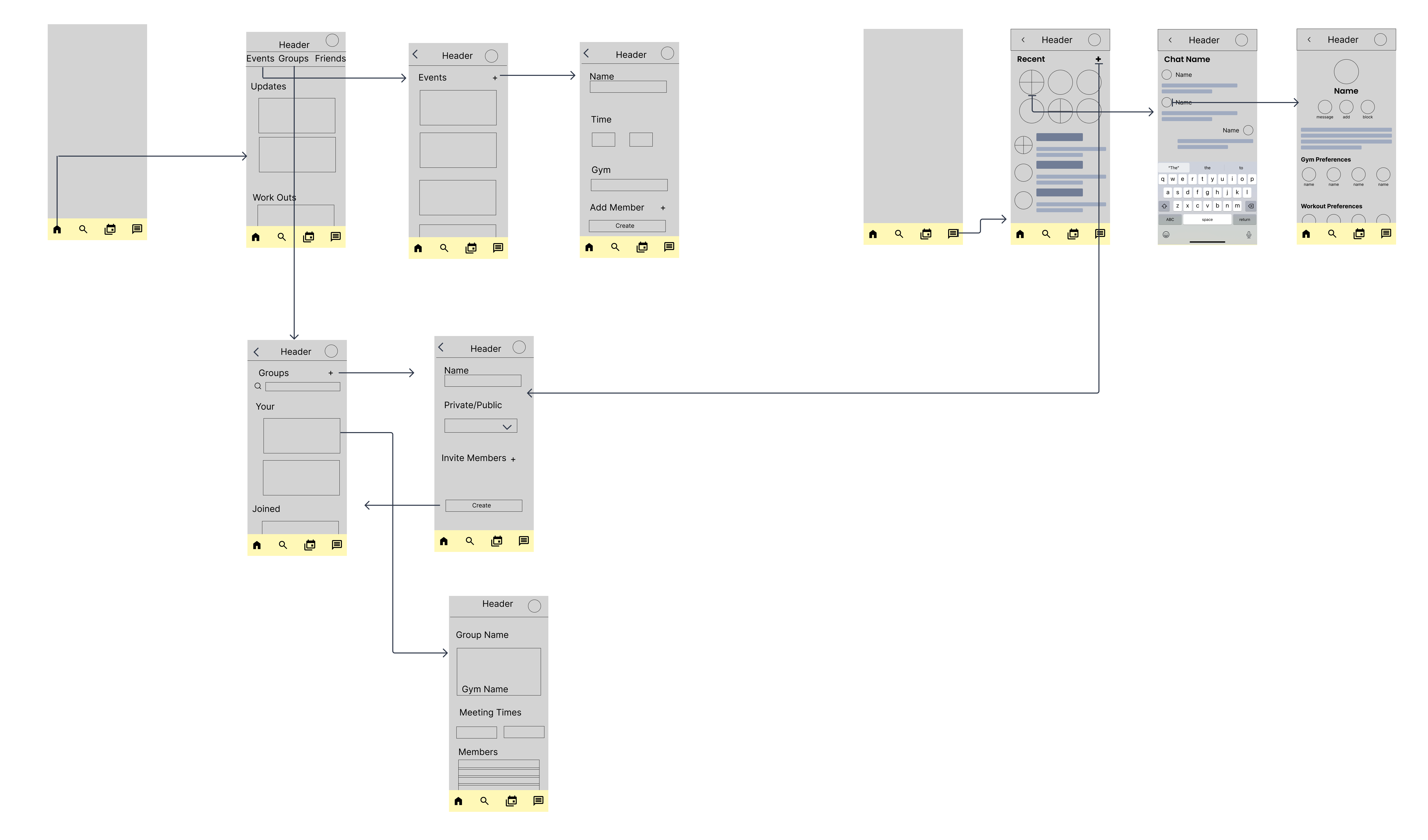
We sketched three rounds of flows before anything went digital, covering the home feed, gym search, group creation, chat, and onboarding. From there we moved into lo-fi wireframes in Figma to map out connected flows we could actually put in front of users.
Test + Learn
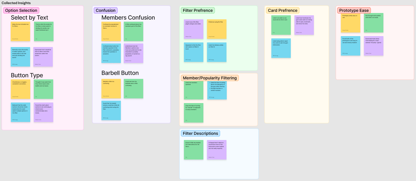
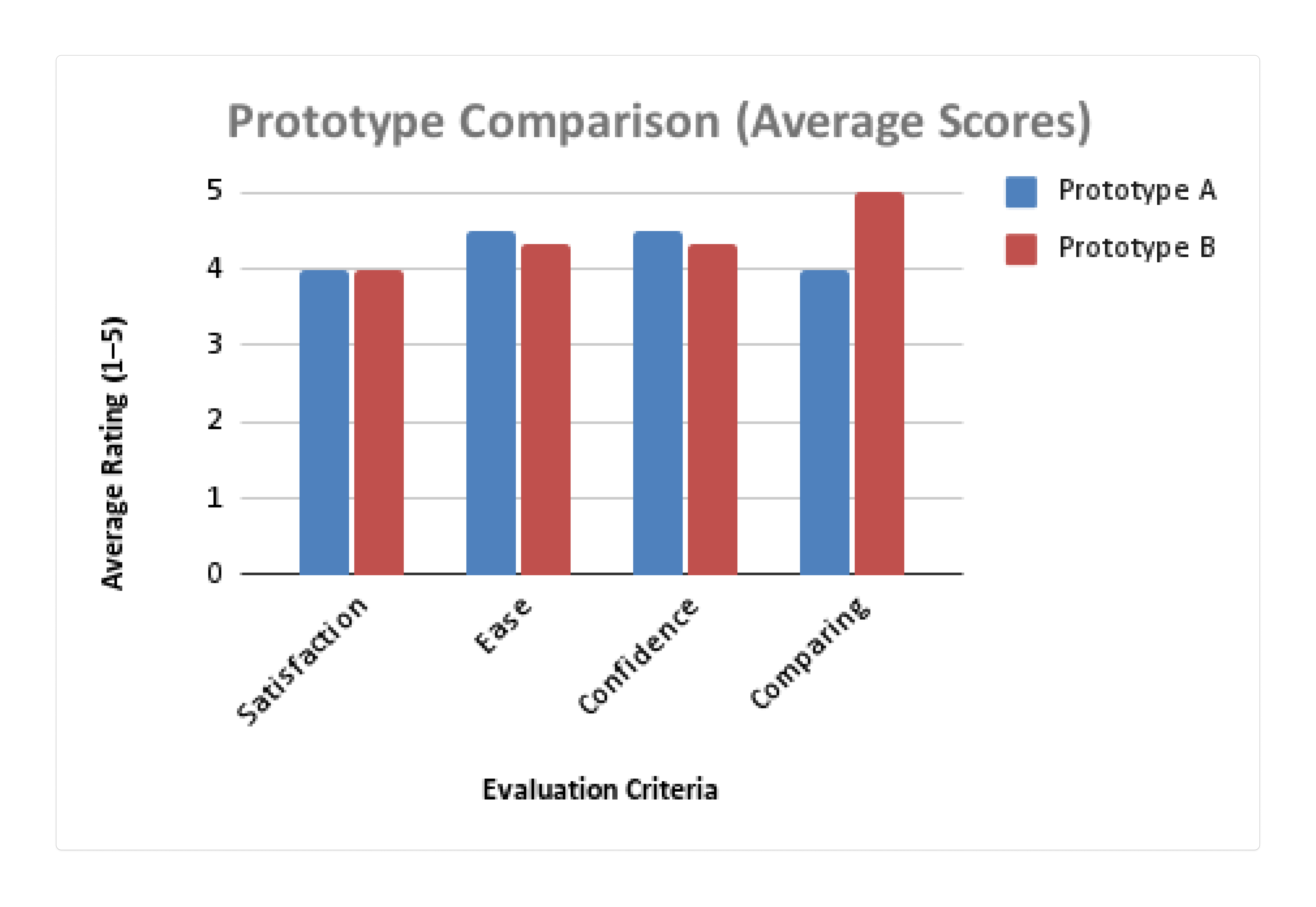
We A/B tested two versions of the gym profile card with four participants. Prototype A scored higher on satisfaction, ease, and confidence. Prototype B had one clear win: users found it easier to compare gyms side by side. Affinity mapping after testing surfaced consistent confusion around the dumbbell checkbox icon and the members/popularity filter wording, both flagged for the next iteration.
Design Decisions
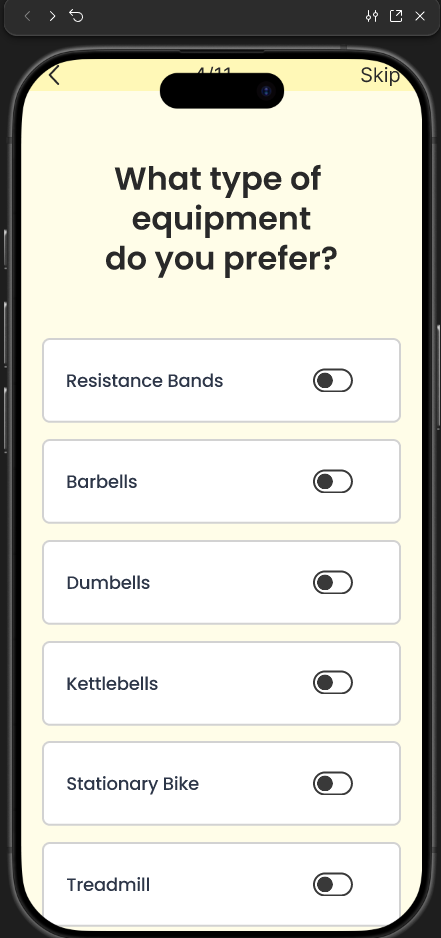
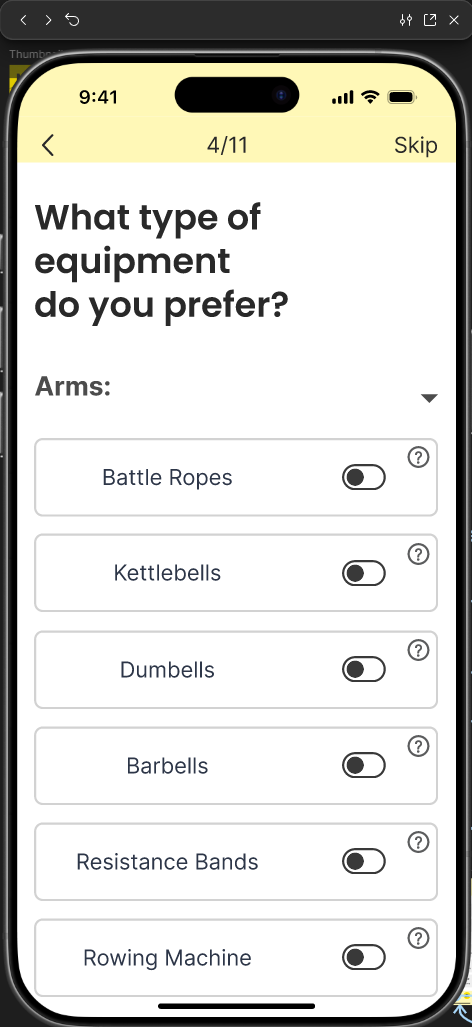
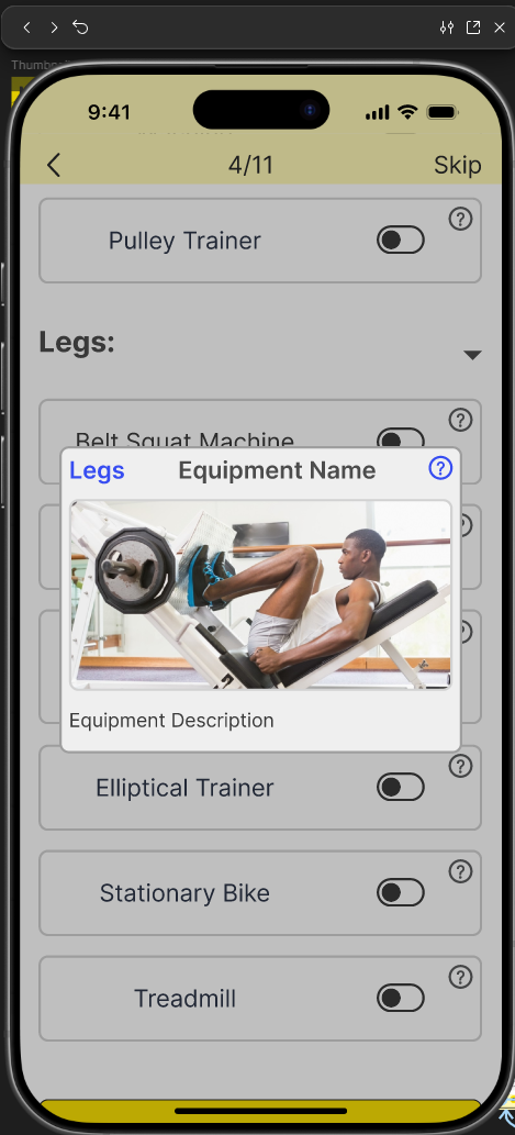
The onboarding survey told us something specific: users understood what we were trying to do, but the questions themselves weren't landing. Wording felt off, some options were unclear, and a few users said they weren't fully confident in their answers. The concept was solid, the execution needed work. The fix we landed on was adding informational icons next to each onboarding question. Instead of rewriting every question and hoping the new copy tested better, we gave users a way to tap and get context on demand. If something felt unclear, the answer was one tap away. It kept the flow fast for users who didn't need it and removed the friction for users who did.
Design System
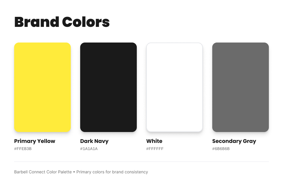
Colors
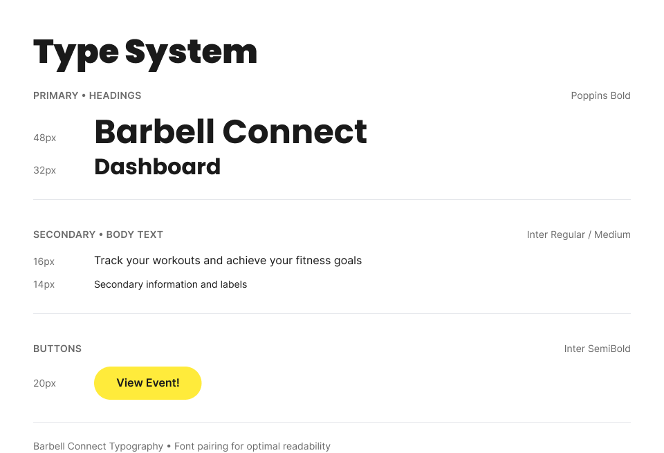
Typography
Reflection and Next Steps
Looking back, the biggest thing I'd change is how we handled leadership. Nobody was one clear owner on this project and our roles shifted around more than they should have. That created some inefficiency, especially when it came to design consistency. We ran into sizing issues mid-project where text was too large across several screens and had to go back and fix it, which is the kind of thing a tighter process upfront would have caught earlier. That said, we learned a lot about what it takes to actually run a Lean UX process end to end as a team. Getting alignment on hypotheses, testing with real users, and letting the feedback shape the design decisions is a different way of working, and it showed in the output.
If we kept building, there's a lot of ground left to cover. Gamification was on the table early and never made it in. The group features have room to grow too, specifically around proximity finding so users could connect with people training nearby. And a geo map with pins of supported gyms would make the discovery experience feel a lot more alive than a list ever could. The foundation is there. It just needs more time.